
In the dynamic world of trading, mastering technical indicators is essential for navigating the markets precisely and confidently. As we enter 2024, certain technical indicators have become prominent, offering traders valuable insights into market trends and opportunities. This article delves into the top 10 technical trading indicators, providing a detailed understanding of each to equip traders, especially those new to the field, with the tools needed for effective market analysis.
Most Popular Trading Indicators
1. Moving Average Convergence Divergence (MACD)
2. Relative Strength Index (RSI)
3. Bollinger Bands
4. Fibonacci Retracement
5. Stochastic Oscillator
6. Moving Averages
7. Average True Range (ATR)
8. Ichimoku Cloud
9. Volume Oscillator
10. Parabolic SAR
Now, let us consider each of these indicators in more detail.
Moving Average Convergence Divergence
The Moving Average Convergence Divergence (MACD) is a popular tool traders use to understand market trends. In simple terms, it helps traders determine which direction an asset’s price might be moving and how strong that movement is.
How Does MACD Work?
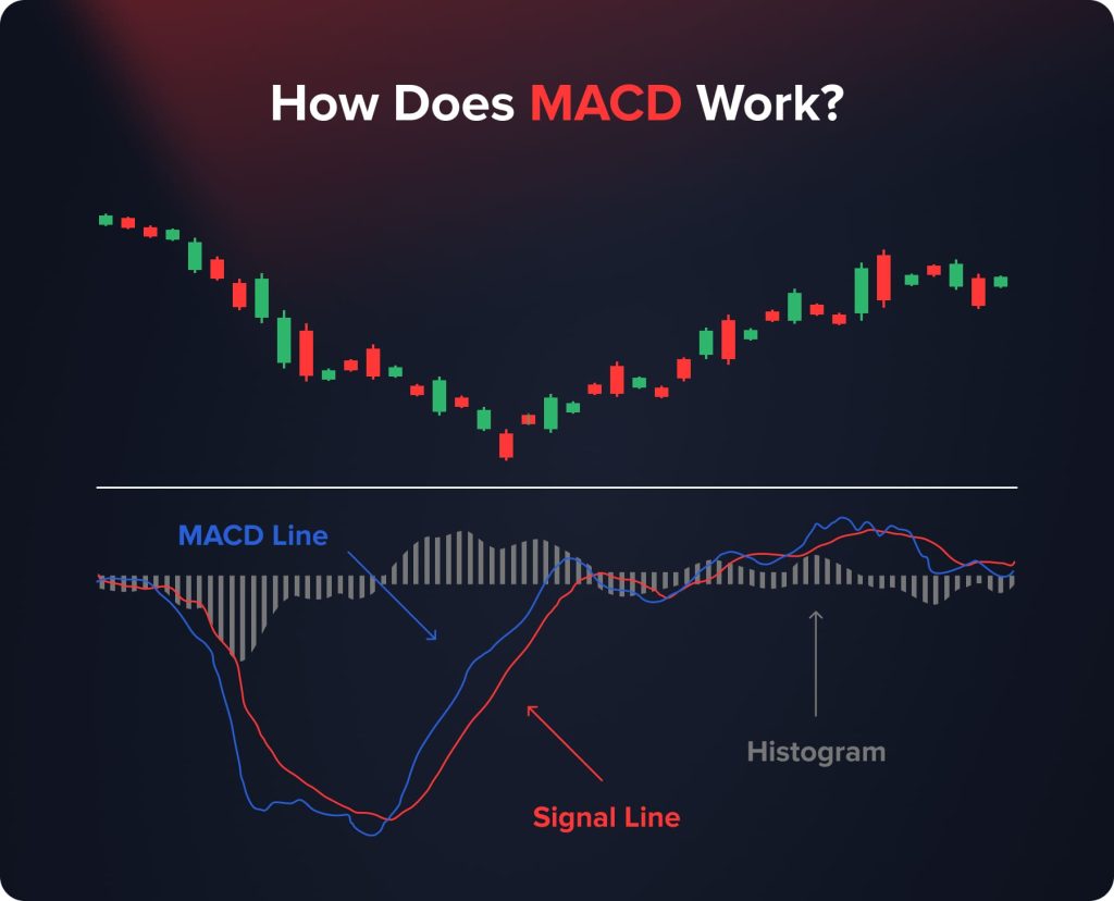
MACD involves three main components:
- MACD Line: This is the main part of the indicator. It’s calculated by taking the difference between two moving averages (usually the 12-day and 26-day Exponential Moving Averages) of an asset’s price.
- Signal Line: This line is typically the 9-day Exponential Moving Average of the MACD line. It acts as a trigger for buy and sell signals.
- Histogram: This is a visual representation showing the difference between the MACD line and the Signal line. It helps in understanding the strength of the price movement.
How to Interpret MACD
Interpreting the MACD involves recognizing certain key signals that indicate potential buying or selling opportunities. When the MACD line, representing the difference between two moving averages, crosses above the Signal line, this is commonly interpreted as a bullish signal, suggesting an optimal time to buy.
On the flip side, when the MACD line crosses below the Signal line, it is often seen as a bearish signal, indicating a possible selling point. Additionally, the MACD histogram, which illustrates the gap between the MACD line and the Signal line, is a handy tool for gauging market momentum. A growing histogram suggests strengthening movement, while a shrinking one indicates weakening momentum.
Why is MACD Useful?
The usefulness of the MACD lies in its clarity and accessibility, making it a valuable tool for both novice and experienced traders. It simplifies the complex movements of the market into clear, understandable signals. One of its key strengths is in signaling the start of new upward or downward trends, giving traders insights into potential market shifts.
Moreover, the visual aspect of the MACD, particularly the histogram, provides a graphical representation of trend strength, aiding traders in making more informed and strategic trading decisions.
Relative Strength Index
The Relative Strength Index (RSI) is a widely used momentum indicator in the trading world, offering insights into the speed and changes in price movements. It’s particularly useful in identifying the overbought or oversold conditions of an asset, currency, or commodity.
How Does RSI Work?
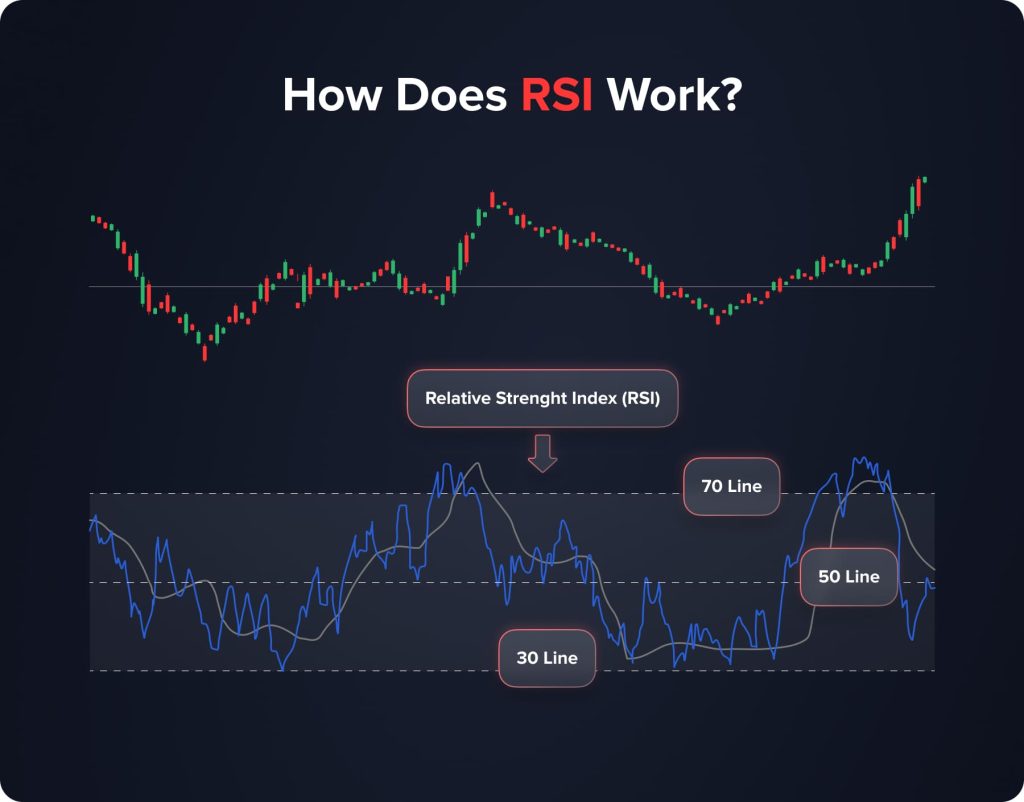
The RSI is calculated based on an asset’s average gains and losses over a specified period, typically 14 days. It is expressed as an oscillator, a line graph that moves between two extremes and can have a reading from 0 to 100. The indicator includes:
- The RSI Line: This line moves within a scale of 0 to 100, providing cues about an asset’s price momentum.
- Overbought and Oversold Levels: These are typically set at 70 and 30, respectively. An RSI above 70 suggests that an asset might be overbought, while below 30 indicates it might be oversold.
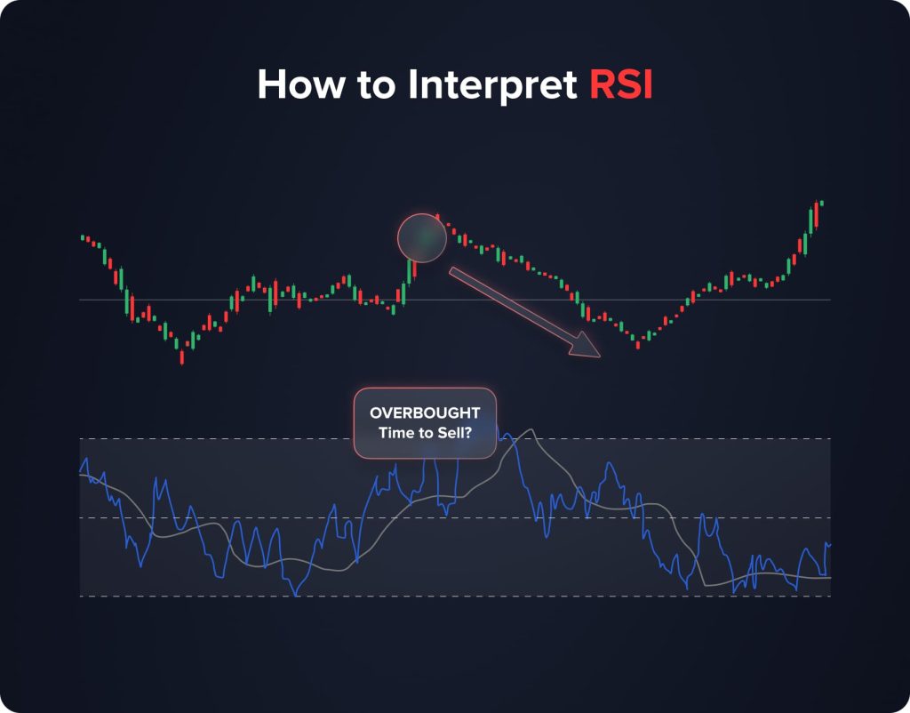
How to Interpret RSI
The interpretation of RSI revolves around its ability to signal potential market reversals. A key aspect of RSI analysis is watching for when the line crosses certain threshold levels. If the RSI line exceeds 70, it suggests that the market is overbought, indicating that a sell-off could be imminent.
On the other hand, if the RSI line falls below 30, it implies that the market is oversold, which could be a cue for a potential buying opportunity. These signals are crucial for traders looking to capitalize on market sentiment shifts.
Why is RSI Useful?
The Relative Strength Index simplifies and clarifies the complexities of market dynamics, making it a valuable asset for traders. One of the key strengths of RSI lies in its capacity to provide clear indications regarding the valuation of assets. By analyzing the trading momentum, RSI helps traders discern whether an asset is potentially overvalued or undervalued at any given point. This aspect of RSI is particularly useful in volatile markets where price fluctuations can be rapid and significant, such as crypto, allowing traders to identify opportunities for buying undervalued asets or selling overvalued ones.
Moreover, the RSI goes beyond just identifying market conditions; it plays a pivotal role in strategic decision-making. Pinpointing potential entry and exit points effectively aids traders in timing their market moves. This capability is essential, especially in fast-moving markets where timing is critical for maximizing returns or minimizing losses. The RSI’s ability to highlight these key moments helps traders execute trades at optimal points, thereby enhancing the potential for successful outcomes.
Bollinger Bands
Bollinger Bands are a versatile and widely used technical analysis tool in trading. Developed by John Bollinger in the 1980s, these bands have become a staple for traders looking to understand market volatility and price levels.
How Bollinger Bands Work
Bollinger Bands consist of three lines: the middle band, typically a simple moving average (SMA) of an asset’s price over a specific period, and two outer bands representing standard deviations away from the SMA. The standard setting is a 20-day SMA with the outer bands set at two standard deviations above and below this average. This configuration creates a dynamic envelope around the price movement of an asset.
How to Interpret Bollinger Bands
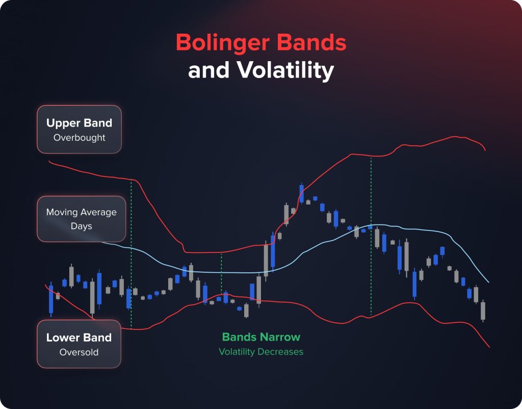
Bollinger Bands are primarily used to gauge market volatility. The key lies in the bands’ expansion and contraction:
- When the bands expand or move further apart, it signals an increase in market volatility, suggesting more significant price movements.
- Conversely, when the bands contract or come closer together, it indicates decreased market volatility, suggesting that price movements might be more subdued.
Moreover, Bollinger Bands can help identify overbought and oversold conditions. When an asset’s price touches the upper band, it may be considered overbought, potentially signaling a sell opportunity. Similarly, if the price hits the lower band, the asset might be oversold, indicating a buying opportunity.
Why are Bollinger Bands Useful?
Bollinger Bands are particularly useful for traders because they visually represent market volatility and price levels relative to historical movements. They adapt to market conditions, providing real-time insights to inform trading decisions. By understanding the bands’ behavior, traders can better anticipate potential price breakouts or reversals. Additionally, Bollinger Bands can be combined with other technical indicators, such as the MACD or RSI, for more robust analysis and validation of trading signals.
Fibonacci Retracement
Fibonacci Retracement is a technical analysis tool rooted in the idea that markets often retrace a predictable portion of a move before continuing in the original direction. Named after the famed Italian mathematician, this tool is based on a series of numbers known as the Fibonacci sequence.
How Fibonacci Retracement Works
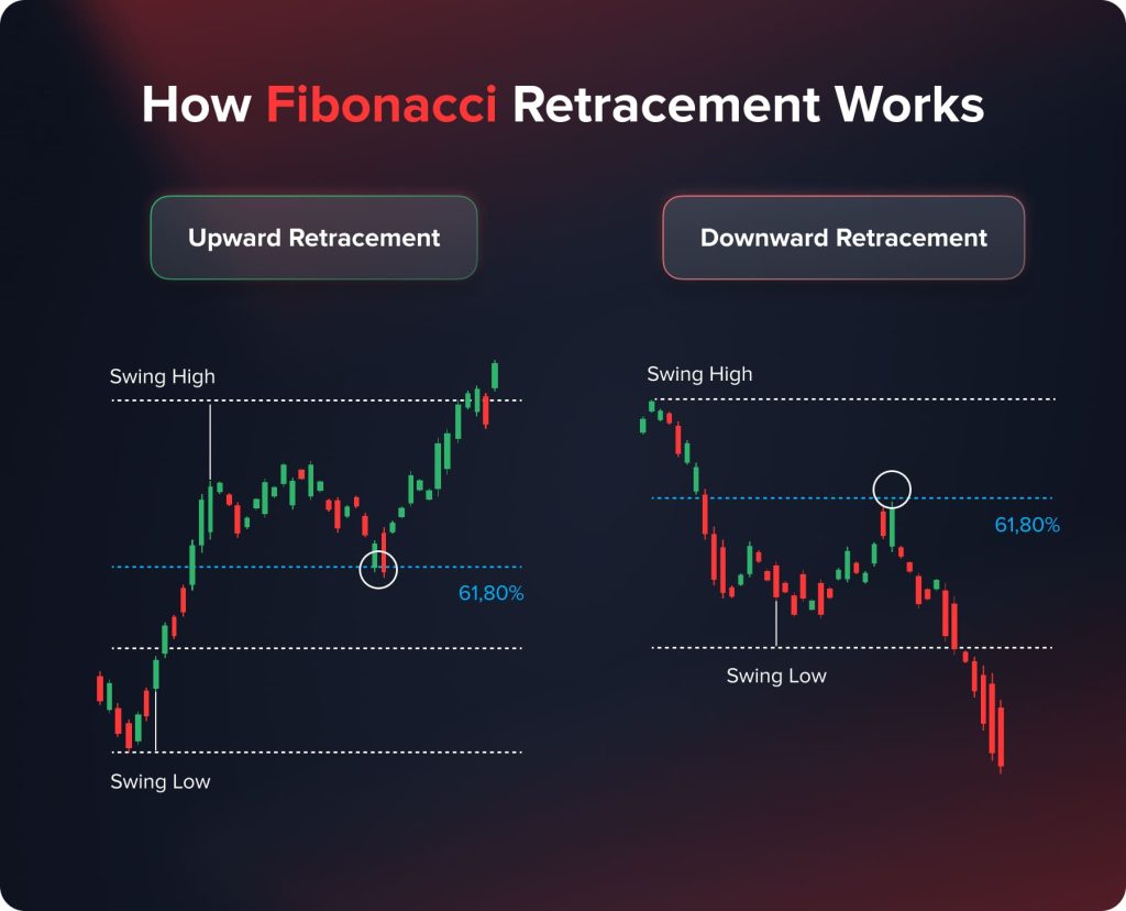
Fibonacci Retracement involves the identification of key Fibonacci ratios – 23.6%, 38.2%, 61.8%, and sometimes 50% and 78.6% – which are used to predict potential reversal levels in the markets. These ratios are derived from the Fibonacci sequence and are applied to charts to forecast where prices might find support or resistance.
Traders plot these ratios on a chart, drawing horizontal lines at each percentage level. These lines then become points of interest for market movements, with the idea being that as a market trends upwards or downwards, it tends to retrace or pull back to these levels before continuing its original trend.
How to Interpret Fibonacci Retracement
Understanding Fibonacci Retracement is about recognizing these levels as potential areas where prices might pause or reverse:
- If the price of an asset falls to a Fibonacci level during an uptrend, it might find support there and start to rise again.
- Conversely, during a downtrend, a Fibonacci level might act as resistance, where the price might struggle to fall below and could bounce back upwards.
Why is Fibonacci Retracement Useful?
Fibonacci Retracement stands out as a particularly useful tool in technical analysis for its predictive qualities and adaptability across various market conditions. This tool aids traders significantly by helping them anticipate potential reversal points in the market. By identifying key support and resistance levels that align with Fibonacci ratios, traders can pinpoint areas where the market may likely experience a turnaround. These levels become crucial for strategizing trades, especially in fast-moving markets.
Furthermore, Fibonacci Retracement levels can be instrumental in setting target prices and stop-loss orders. Traders often use these levels to determine strategic entry and exit points, thereby optimizing their trading strategies. This aspect of Fibonacci Retracement is particularly beneficial for planning trades and managing risks, as it offers structured and well-defined points for taking profits or cutting losses, aligning closely with the trader’s risk management strategies.
Stochastic Oscillator
The Stochastic Oscillator is a momentum indicator that compares a particular closing price of an asset to its price range over a specific period. Developed by George C. Lane in the 1950s, it is designed to predict price turning points by comparing the closing price of an asset to its price range.
How Stochastic Oscillator Works
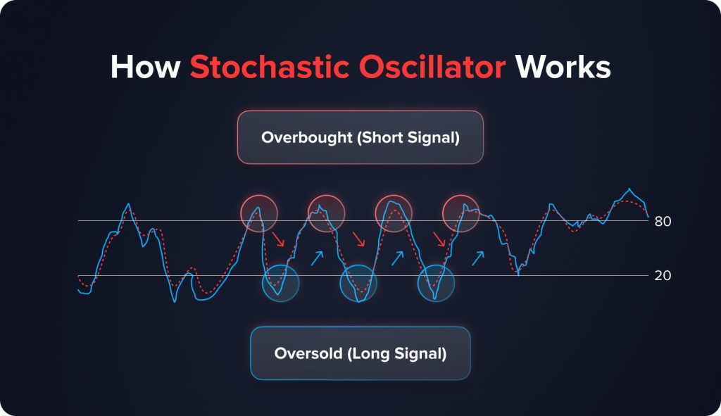
The Stochastic Oscillator is calculated using two lines: the %K line, which measures current price levels relative to the high-low range, and the %D line, which is a moving average of the %K line. Typically, the %K line is calculated using a 14-period timeframe and is a ratio expressed in percentage terms. The %D line is usually a 3-period moving average of the %K line.
Interpreting the Stochastic Oscillator
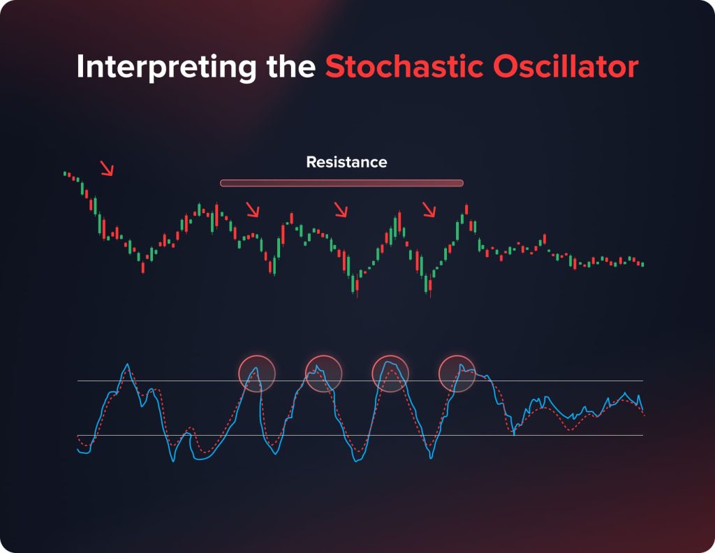
The key to using the Stochastic Oscillator effectively lies in understanding its signals:
- Overbought and Oversold Conditions: The oscillator ranges between 0 and 100. Readings above 80 are generally considered overbought, while readings below 20 are considered oversold. These conditions suggest potential reversals in the asset’s price.
- Crossovers: A buy signal is generated when the %K line crosses up through the %D line, especially below the 20 level. Conversely, a sell signal occurs when the %K line crosses down through the %D line above the 80 level.
Why is the Stochastic Oscillator Useful?
The Stochastic Oscillator stands out in the realm of trading for its exceptional ability to provide early warnings of potential price reversals. This quality is immensely beneficial for traders, particularly in identifying overbought or oversold conditions in the market. When an asset reaches these extreme conditions, it often indicates a forthcoming shift in price direction, allowing traders to prepare for either buying or selling opportunities.
Furthermore, the oscillator is instrumental in aiding traders with timing market entries and exits. The crossovers within the Stochastic Oscillator – points where its two lines intersect – serve as critical indicators. These crossovers can signal the right moments to initiate or close positions, giving traders an edge in capitalizing on market movements.
Moving Averages (Simple and Exponential)
Moving Averages, encompassing both Simple Moving Averages and Exponential Moving Averages, are foundational tools in technical analysis. These indicators smooth out price data over a specified period, providing a clear view of the trend direction.
How Moving Averages Work
Simple Moving Averages (SMA): The SMA is calculated by averaging the closing prices of an asset over a set number of days. For instance, a 20-day SMA would add up the closing prices over the past 20 days and divide by 20. This average is then plotted on a chart and continually updated.
Exponential Moving Averages (EMA): The EMA, similar to the SMA, focuses on recent prices. It gives more weight to the latest data points, making it more sensitive to recent price changes. EMAs are calculated by applying a weighting to the most recent data.
Interpreting Moving Averages

Moving Averages help in identifying the trend direction and potential reversal points:
- Trend Identification: If the price of an asset is above its moving average, it suggests an upward trend, and conversely, if it’s below, it indicates a downward trend.
- Crossovers: When a short-term moving average crosses over a long-term moving average, it can signal a change in the trend direction. For example, if a 10-day EMA crosses above a 50-day EMA, it might indicate a bullish turn.
Why are Moving Averages Useful?
Moving Averages are particularly cherished in the trading community for their straightforwardness and efficacy. These indicators provide a lucid visualization of market trends, effectively sifting through the day-to-day volatility and ‘noise’ that can obscure the underlying direction of the market. This clarity is invaluable for traders who must distinguish between short-lived price changes and genuine trend shifts.
Moreover, the versatility of Moving Averages is a key attribute that enhances their utility. They can be customized to suit various time frames, making them equally relevant for short-term day traders looking for quick market entry and exit points and long-term investors focusing on broader market movements. This adaptability allows traders of all kinds to tailor their analysis to their specific trading styles and goals.
Another significant advantage of Moving Averages is their function as dynamic support and resistance levels. These levels are not fixed but change with the moving average, providing traders with up-to-date information to decide when to enter or exit a trade. This dynamic nature of Moving Averages makes them a proactive tool in a trader’s arsenal, offering real-time insights that are crucial for successful trading strategies.
Average True Range
The Average True Range (ATR) is a technical analysis tool that measures market volatility. Developed by J. Welles Wilder Jr., it’s not used to predict price direction but rather to gauge the degree of interest or disinterest in a move.
How Average True Range Works
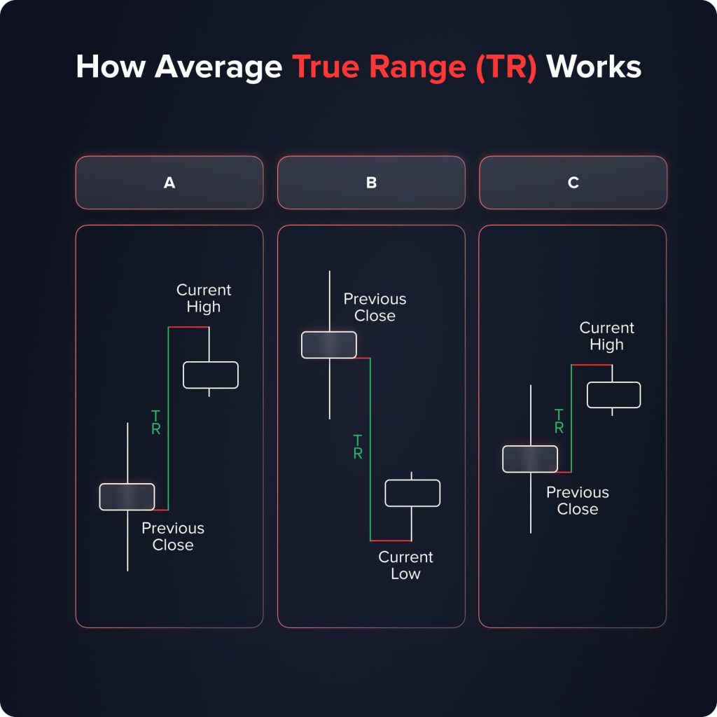
ATR calculates the degree of price volatility by taking the average of true ranges over a specified period. The true range is the greatest of the following:
- The current high minus the current low.
- The absolute value of the current high minus the previous close.
- The absolute value of the current low minus the previous close.
This value is then averaged over a period, commonly 14 days, to obtain the ATR. It’s expressed as a single number representing the average amount an asset’s price has fluctuated over the last 14 days.
Interpreting the Average True Range
The ATR is particularly useful in understanding the volatility of an asset:
- A high ATR indicates high volatility, with large price movements, either up or down.
- A low ATR suggests lower volatility with less dramatic price movement.
Why is the Average True Range Useful?
The ATR emerges as an invaluable tool for traders, particularly in regard to risk management and position sizing. Its primary utility lies in its ability to convey market volatility clearly and objectively. For risk management, understanding the volatility highlighted by the ATR can inform traders on how far to set their stop-loss orders from their entry points. This approach allows for more effective management of potential losses, aligning them with the current market conditions and the trader’s individual risk tolerance.
In terms of position sizing, the ATR plays a crucial role. Providing a gauge of the market’s volatility enables traders to make informed decisions about the size of the positions they should take. This aspect of the ATR is particularly important in ensuring that traders do not find themselves overexposed to risk in turbulent market conditions. The ATR’s guidance helps balance seeking profit opportunities and mitigating potential losses, an equilibrium vital for successful trading.
Ichimoku Cloud
The Ichimoku Cloud, also known as Ichimoku Kinko Hyo, is a comprehensive indicator that provides information about support and resistance levels, trend direction, momentum, and potential entry points. Developed by Goichi Hosoda in Japan, this indicator is a favorite among traders for its depth of information and visual ease of interpretation.
How Ichimoku Cloud Works
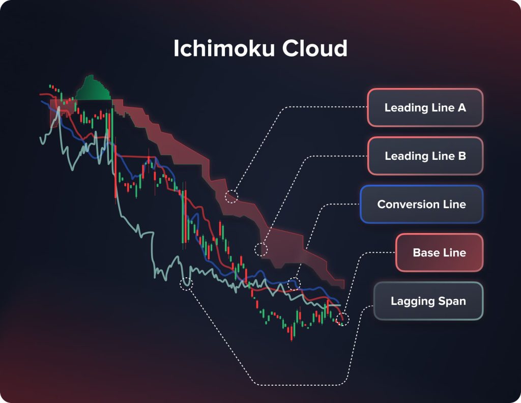
The Ichimoku Cloud consists of five main components:
- Tenkan-sen (Conversion Line): Calculated as the average of the highest high and the lowest low over the past nine periods.
- Kijun-sen (Base Line): The average of the highest high and the lowest low over the past 26 periods.
- Senkou Span A (Leading Span A): The average of the Tenkan-sen and Kijun-sen, plotted 26 periods ahead.
- Senkou Span B (Leading Span B): The average of the highest high and the lowest low over the past 52 periods, plotted 26 periods ahead.
- Chikou Span (Lagging Span): The current period’s closing price is plotted 26 periods behind.
The space between Senkou Span A and Senkou Span B forms the “cloud,” which can indicate potential support and resistance areas.
Interpreting the Ichimoku Cloud
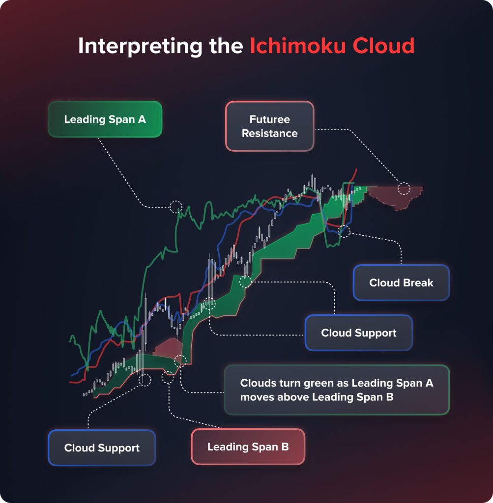
The Ichimoku Cloud is renowned for its multifaceted approach to market analysis, offering traders a wealth of signals. It serves as a guide for discerning trend direction, momentum, and potential support and resistance levels. The cloud gauges the trend direction formed by Senkou Span A and B. When the price floats above the cloud, it suggests a bullish trend, whereas a position below the cloud indicates a bearish trend.
In terms of momentum and strength, the Ichimoku Cloud is particularly insightful. The interaction and crossover of the Tenkan-sen and Kijun-sen lines, representing short-term and medium-term momentum, respectively, are closely monitored for signs of market strength or weakness.
Furthermore, the cloud dynamically adjusts to market conditions, acting as a continuously evolving support and resistance area. This aspect of the Ichimoku Cloud is critical in identifying potential buy and sell zones as it adapts to the latest market movements.
Why is Ichimoku Cloud Useful?
The Ichimoku Cloud is a comprehensive and adaptable tool for technical analysis. It provides a complete market view by seamlessly integrating trend analysis, momentum tracking, and volatility into a single, coherent visual. This holistic market snapshot is invaluable for traders seeking to understand the full context of market movements.
Moreover, the cloud structure within the Ichimoku system offers intuitive visual cues. These cues are particularly useful in identifying key support and resistance levels, thereby aiding traders in pinpointing strategic entry and exit points in their trades.
Another significant advantage of the Ichimoku Cloud is its forward-looking capability. Unlike many traditional indicators that solely focus on past and present data, the Ichimoku Cloud projects certain elements into the future.
Volume Oscillator
The Volume Oscillator is a valuable technical analysis tool that measures the difference between two moving averages of an asset’s volume. It is an excellent indicator for understanding the strength behind price movements and market trends.
How the Volume Oscillator Works
The Volume Oscillator operates by calculating the difference between two volume moving averages, typically a short-term and a long-term average. Common settings use a 5-day and a 20-day moving average. The oscillator can be presented either as a percentage or in absolute terms. The key idea is to observe how short-term volume trends compare with longer-term volume trends.
Interpreting the Volume Oscillator
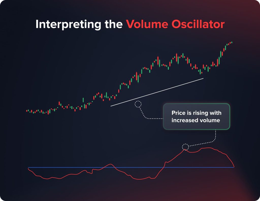
Interpreting the Volume Oscillator involves understanding what the differences in moving averages signify:
- A positive reading, where the short-term volume exceeds the long-term volume, indicates strong market interest and buying pressure. This could suggest a continuation of the current trend, especially if accompanied by rising prices.
- Conversely, a negative reading, where short-term volume falls below long-term volume, suggests declining market interest and selling pressure. This might signal a potential reversal or a weakening trend.
Why is Volume Oscillator Useful?
The Volume Oscillator stands as a powerful asset in a trader’s toolkit, primarily due to its effectiveness in affirming or challenging the prevailing market trends. It enhances the analysis of price actions by offering deeper insights into market participation levels. For instance, in a market that’s experiencing an upward trajectory, an ascending Volume Oscillator lends credibility to the uptrend. This scenario indicates that the upward movement is backed by increased volume, signifying strong buyer interest and market support for the continuing trend.
Conversely, in a market that’s witnessing a downward trend, a declining Volume Oscillator plays a crucial role in corroborating the downtrend. It reveals a reduction in market interest or increased selling pressure, signaling that the downward movement is not just a temporary fluctuation but a trend supported by market consensus.
Parabolic SAR
The Parabolic Stop and Reverse (Parabolic SAR) is a unique and widely used technical analysis tool designed to identify potential reversals in the market’s price direction. Developed by J. Welles Wilder Jr., it’s particularly known for its effectiveness in capturing short-term trends.
How Parabolic SAR Works
The Parabolic SAR is represented as dots or points on a chart, either below or above the price line. These points are calculated through a complex formula that takes into account the rate of price movement, with the position of the dots indicating the trend direction and potential reversal points:
- When the dots are below the price, it signals a bullish trend, suggesting an upward momentum.
- Conversely, dots above the price indicate a bearish trend, pointing to a downward momentum.
Interpreting the Parabolic SAR
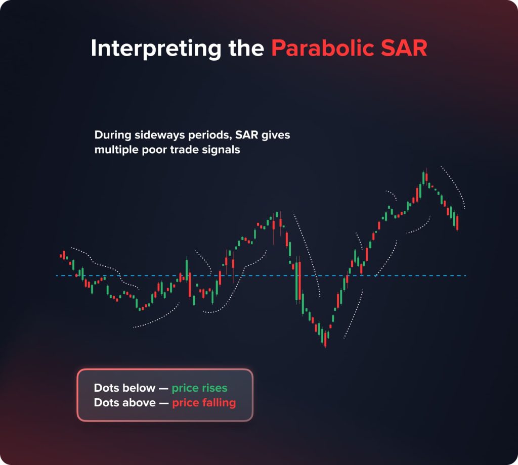
Interpreting the Parabolic SAR is centered around observing dot placements in relation to the asset’s price on a chart. This method offers a visual guide to understanding market momentum and potential trend changes. When the dots that constitute the Parabolic SAR shift from being positioned above the price line to below it, it’s often interpreted as a bullish reversal signal. This shift suggests a surge in buying pressure, presenting a potential buying opportunity for traders. On the other hand, when these dots move from below to above the price line, it indicates a bearish reversal. This change is typically seen as a cue for a potential selling opportunity, signaling an increase in selling pressure and a possible downward trend in price.
Why is Parabolic SAR Useful?
The Parabolic SAR is a highly esteemed tool among traders, thanks to its ability to provide clear and unambiguous signals. This clarity is particularly crucial for effectively timing market entries and exits, as it helps identify moments of trend reversals. One of the standout features of the Parabolic SAR is its unique presentation on charts — the dots are not only straightforward to interpret but also aid significantly in setting stop-loss points. This feature is particularly beneficial for managing risk and safeguarding investments against sudden market shifts.
The Parabolic SAR is known for its adaptability to various market conditions. Whether the market is trending or moving sideways, the Parabolic SAR adjusts its signals accordingly, making it a flexible tool for different trading scenarios. This versatility makes it an invaluable asset for traders in 2024, allowing for the developing of dynamic trading strategies suited to the ever-changing market landscapes.
Directional Movement Index
Introduced by J. Welles Wilder Jr., Directional Movement Index is among the most in-demand tech indicators used for understanding the direction and strength of a current market trend.
How Does Directional Movement Index Work
The indicator contains three “sub-indicators”:
- Positive directional indicator (+DI);
- Negative directional indicator (-DI);
- Average directional index (ADX).
When talking about the DMI formula, the calculations are rather complicated as both positive and negative directional indicators are built with the help of Smoothed Directional Movements (Current Highs/Lows – Previous Highs/Lows) and Average True Range.
How to Interpret Directional Movement Index?
While interpreting the DMI tech indicator, traders primarily take into account the location of +DI and –DI lines.
- If the +DI line goes higher than the –DI line, an asset’s price is going to rise.
- In case when the –DI line prevails over the +DI line, the market is waiting for the price to drop.
The crossovers of +DI and –DI lines are understood as signals for opening or closing positions. Such moments are the indicators of the ongoing trend reversal.
Why is Directional Movement Index Useful?
The DMI tech indicator is an exceptionally useful instrument for identifying trend direction and strength. The index is equally effective on different financial markets and timeframes. On the other hand, DMI is a lagging instrument; here is why traders activate some additional instruments to confirm a current trend.
Aroon
Aroon falls into the category of trend tech indicators. The instrument helps traders identify the strength of a current trend. Such an indicator was introduced by Tushar Chande, an American tech analyst.
How Does Aroon Work
The Aroon indicator consists of the two lines:
- Aroon Up;
- Aroon Down.
The above mentioned lines are linked to the highest and lowest prices of an asset within the given period. For instance, a trader activated the Aroon indicator with the default length (14). We get the following situation:
- Aroon Up = ((14 – the number of days after the highest price appeared) / 14) * 100;
- Aroon Down ((14- the number of days after the minimum price appeared) / 14) * 100.
Here is why Aroon lines are represented by the numbers between 0 and 100.
How to Interpret Aroon?
Aroon is exceptionally simple to interpret. Traders understand the instrument as any other oscillator indicator:
- The closer to 100, the stronger a current trend is;
- The closer to 0, the weaker a current trend is;
- When the indicator is near 50, the consolidation takes place.
When interpreting the indicator, it is important to keep an eye on both lines:
- When the Aroon Up line is higher than 50 and goes to 100, and the Aroon Down line is lower than 50, the downtrend dominates the market.
- When the Aroon Down line is higher than 50 and goes to 100, and the Aroon Up line is lower than 50, the uptrend dominates the market.
Why is Aroon Useful?
The indicator helps traders identify which trends currently dominate on the market and how strong it is. Traders use the crossovers and divergences of Aroon lines as signals for opening their positions. The instrument can be used as the basic one or being combined with other tech indicators.
Williams Alligator
Alligator is among the most widely used indicators introduced by the world-known trader and analyst, Bill Williams. The instrument provides traders with signals for opening and closing their positions. Alligator is among the best solutions for beginners as it functions as an independent trading system.
How Does Williams Alligator Work?
Alligator is a tech indicator that is built upon the three Moving Averages. When talking about default settings, the Moving Averages have the following lengths: 13, 8, and 5. Furthermore, the offset is activated for every MA: 8, 5, and 3 accordingly.
The three Moving Averages that form the indicator are called
- Jaw (MA 13);
- Teeth (MA 8);
- Lips (MA 5).
Traders may activate other settings, but it is important to maintain the proportion between the length and the offset of Moving Averages; otherwise, the instrument will generate false signals.
You may also like


Demetris Makrides
December 20, 2024
How to Interpret Williams Alligator?
According to Bill Williams himself, Teeth (MA 8) are the most important part of the alligator; which is why traders need to pay the most attention to that line. One should open a position in the following cases:
- The Lips line crosses the Teeth line from the top down. Traders open long positions.
- The Lips line crosses the Teeth line from the bottom to the top. Traders open short positions.
Why is Williams Alligator Useful?
First and foremost, this indicator can be used as an independent trading system. Williams Alligator is equally effective on different markets and timeframes. Bill Williams used the instrument within his Profitunity trading system.
Keltner Channel
Keltner Channel is a tech indicator based upon an asset’s volatility. On the one hand, the instrument helps traders identify the current market trend. On the other hand, the instrument builds a channel within which an asset’s price is going to move. This indicator was introduced by Charles Keltner, an American grain merchant, in the 1960s.
How Does Keltner Channel Work?
Keltner Channel consists of three lines:
- The middle line is represented by Exponential Moving Average (EMA) with the length 20 (default settings).
- The upper and lower borders of the channel are built with the help of ATR (Average True Range) multiplied by 2.
When activating the instrument, traders are able to change the following settings: EMA Length, ATR Length, ATR Multiplier.
How to Interpret Keltner Channel?
Traders get the following information from the indicator:
- When an asset’s price touches the upper border of the channel, the bullish trend dominates the market.
- When an asset’s price touches the lower border of the channel, the bearish trend dominates on the market.
- The direction of Keltner Channel shows the current trend direction.
- An asset’s price can move within the channel. In such a case, the lower and upper borders of the channel are understood as support and resistance levels.
Why is Keltner Channel Useful?
Keltner Channel can be used for identifying the current market trend and its direction. The instrument is also effective for predicting ongoing trend reversals. At the same time, traders can open and close positions using Keltner Channel borders as support and resistance levels.
On Balance Volume
On Balance Volume is among the first VSA (Volume Spread Analysis) instruments. The OBV indicator appeared in 1963, invented by Joe Granville. First and foremost, the instrument was used on the stock market, then transferred to other financial markets.
How Does On Balance Volume Work
On Balance Volume shows the interdependence between price changes to the corresponding volumes. The indicator takes place below the main chart in the independent window. The line shows how many stocks, units, lots, etc. are traded within a certain period of time. The instrument provides traders with the following information:
- OBV shows the ratio of price changes and trading volumes changes and empowers traders to predict price impulses.
- The instrument shows the market situation and the behavior of major players.
You may also like

Demetris Makrides
September 13, 2024
How to Interpret On Balance Volume?
There are several possible market situations that can be identified by a trader:
- Trend confirmation. The indicator moves higher, together with the price growth or drops down together with the price. The current trend is going to stay further.
- Divergence. The OBV line is moving higher when an asset’s price drops down, or vice versa. This situation is a marker of the ongoing trend reversal.
- Explosive growth of trading volumes. When a trader sees sharp movement of the OBV indicator, it is highly predictive that an asset’s price is going to rise/fall rapidly in the same direction.
- The MA crossover. When the OBV line is crossed by its Moving Average, traders should open long (the crossover from the bottom to the top) or short (from the top down) positions.
Why is On Balance Volume Useful?
On Balance Volume cannot be used as an independent trading strategy, but the indicator is an exceptionally useful instrument for a trend confirmation. One can apply OBV for all financial markets and timeframes.
Conclusion
As we venture into 2024, the landscape of technical trading continues to evolve, bringing forth both challenges and opportunities. The ten indicators discussed in this article offer unique insights and strategies for navigating the markets. When used effectively, these tools can give traders a deeper understanding of market trends, momentum, and potential entry and exit points. From gauging market volatility with ATR to identifying trend reversals with the Parabolic SAR, each indicator adds a layer of sophistication to a trader’s analysis. As the financial markets become increasingly complex, the importance of these technical indicators in formulating comprehensive trading strategies cannot be overstated.
Disclaimer
This article is intended for informational purposes only and should not be considered financial advice. The use of technical indicators involves risks and is subject to individual interpretation. Traders should conduct their own research and consult with financial advisors before making investment decisions. The effectiveness of these indicators can vary based on market conditions and personal trading strategies, and past performance is not indicative of future results.